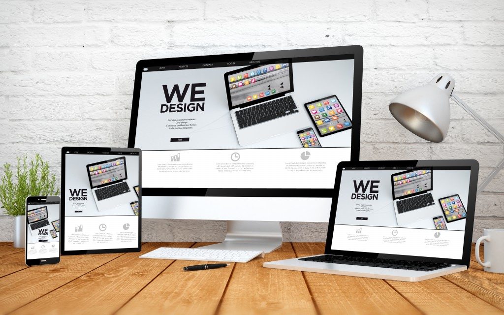
Web design has undergone different style changes since its introduction into business marketing some years back. The backgrounds currently used for sites are one of the fundamental changes you might notice if you compare modern websites and those designed about ten years ago. Backgrounds in web design are now a core design element and will determine the visual interest of your site. There are two categories of background for websites including content and body backgrounds.
The body background of the web design you choose for your Minnesota-based business includes an illustration, pattern, or image and is ‘behind’ the content background. The content background is generally ‘placed on’ the body background and includes text and images. This is the most challenging part of web design, and any mistakes will ruin your entire website’s content. Here are some tips to liven up your content background without going over the top and making your website look like a joke.
Simple Gradients
Creating a gradient between the body and content backgrounds can lend an interesting visual pattern to your site and enhance the visibility of both types of backgrounds. You can achieve this by tweaking the colors, fonts, and sizes of the letters and images used for both backgrounds. You should, however, ensure that the elements you pick work together to avoid the creation of a site that is ‘too busy.’
Add Texture
Textures in website design help to reinforce the theme of your whole website. A grungy texture, for instance, will be perfect for a music website dealing in rock-and-roll music. The texture you use should be subtle so that it will not overpower the text and images on your site and decrease their legibility. Most modern minimalist websites opt for the same texture for their body and content backgrounds, but the content background comprises a lighter texture compared to the texture of the body background.
Use Layered Designs with Semi-Transparent Content Backgrounds

You can create a layer between your body and content backgrounds by using a semi-transparent design. Transparency will allow your body background’s visibility while separating it from your content. In this option, it is essential to use colors that contrast your body and content backgrounds. This guarantees your content remains visible and minimizes a visual distraction from the body background.
Use Content Backgrounds with Styled Wrappers
Designing a content background’s edge without affecting your content is challenging but not impossible for experts. The borders of your content background can be styled to match your body background and still accommodate your desired content. You can achieve this by incorporating different patterns along the edges of your content backgrounds. Other than creating an interesting visual angle, this option allows you to display multiple content backgrounds on one body background.
Every business is now looking for every avenue to cut back on its operating costs. Most opt for DIY web design under the guidance of YouTube ‘expert’ videos. Without a professional’s input and recommendation on how to make the above tip work for you, your website will generally be a failed investment and negatively affect your online marketing.

